The Luxury Packaging Awards are a brand new annual event that celebrates the best and brightest in luxury product packaging design. This year’s inaugural event took place at the wonderful Underglobe on London’s Bankside, with a shortlist of hopefuls that included companies as Stölzle Oberglas, Allied Glass and many more.
Black Bottle Whisky by Allied Glass
Rogue by Rihanna by Glass Stölzle Oberglas
The awards are organised by Packaging News, and run in conjunction with the annual easyFairs’ Luxury Packaging exhibition and conference. The awards aim to showcase the most inventive and original designs from around the world in a range of categories from food and drink to cosmetics, perfumes, bags and tobacco products.
The nominees are judged by a panel of industry experts on several different criteria, including:
- Quality and innovation in graphics, decoration, shape and structure.
- Functionality.
- Shelf stand-out.
- How the pack adds value to the brand.
- Luxury feel.
The winners were announced on September 29th in front of a special V.I.P crowd; here are our reactions to the winners, from Rajapack’s Senior Buyer Kezia Gray and Purchasing Manager Hector Au
- Drinks Primary Pack – Tanqueray No Ten by Allied Glass
Kezia really liked this new take on the Tanqueray bottle. It was reminiscent of the Art Deco period with its classical, yet contemporary styling. Kezia felt it was definitely an improvement on the current bottle and it looks an expensive, premium product.
- Drinks Secondary Pack – Glengoyne 25-year-old Highland Single Scotch Whisky by PPS
Hector regarded the design as very old fashioned and doesn’t think this is pushing the boundaries much in terms of the ‘Whisky bottle in a box’ theme. The design evokes ideas of a late 19th and early 20th century heritage.
- Perfume Pack – Tresor Repack by Stolzle Oberglas
Kezia thought the design was very old fashioned for the perfume market. She wasn’t sure what demographic the product was targeted to. For her it wasn’t enough of an inspiring design to warrant being on the winner’s list.
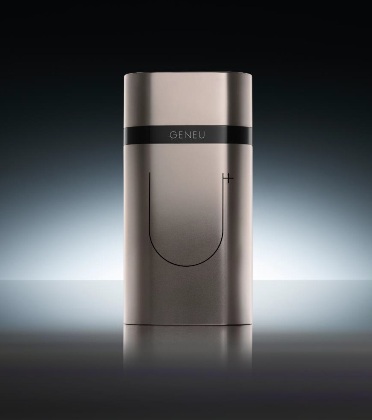
- Cosmetics & Personal Care Pack – GENEU Airlift Pump System by Toly Products UK
Both Hector and Kezia found it difficult to understand what this product could offer you from the packaging alone. For Hector it reminded him of a late 90s Armani perfume or after shave dispenser.
- Jewellery & Accessories Pack – New Accurist Watch Box by Hunter Premium Packaging
Hector thought that the packaging gave the product a more upmarket feel. However, he thinks that Accurist need to do more with the overall brand, to change perceptions of this brand. But nonetheless a valiant effort.
- Luxury Food Pack – Aloha Gelato Box by Pringraf
This evokes memories of American style take away Chinese food packaging. But one thing was on Hector and Kezia’s minds in terms of how the frozen ice cream filled fruits were insulated within the packaging. Was there a polystyrene inner layer that we could see from the photos?
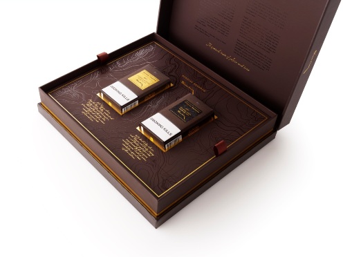
- Luxury Tobacco Pack – Dunhill Special Reserve Limited Edition Global Travel Retail Pack by Webb DeVlam
Both Kezia and Hector felt that there was more packaging than there was actual product. But they agreed it had a very upmarket look. Wouldn’t look out of place in a Gentleman’s club or an old fashioned smoking room.
- Luxury Shopping Bag – Rose Demi Sec La Montina by Gruppo Cordenons
Kezia liked the bag for its very contemporary look – she regarded it as a modern, Mediterranean take on a typical upright bottle packaging concept. Perfect for hot, summery weather.
- Special Edition – Bombay Sapphire Laverstoke Mill Distillery Limited Edition by Webb deVlam
Not a massive departure from the iconic Bombay Sapphire standard bottle, it is more of an evolution says Hector. It is more see through and less opaque than the standard bottle and similar to the approach Cristal have followed with their champagne bottles.
- Innovation of the Year – Absolut Originality by Ardagh Group
Both Hector and Kezia preferred the standard bottle design with its italic script on the label rather than the blue vein design that runs through the glass. The shape of the bottle hasn’t really changed that much, it’s really only the label that looks different. But they both thought it was less exclusive looking than the standard bottle design.
- Best in Show – Aloha Gelato Box by Pringraf
Both Hector and Kezia would have opted for other designs that were up for this award rather than the Gelato box. For Kezia it was the luxury shopping bag for the Rosé wine and for Hector the Tanqueray bottle was more to his liking.


